Updated Monthly Calendar View
Mod Version: 1.02, by Wayne Luke
This modification is in the archives.
| vB Version: 3.7.0 Beta 2 | Rating: |
Installs: 135 |
| Released: 20 Dec 2007 | Last Update: 20 Mar 2008 | Downloads: 416 |
|
|
||
A collection of Calendar Modifications
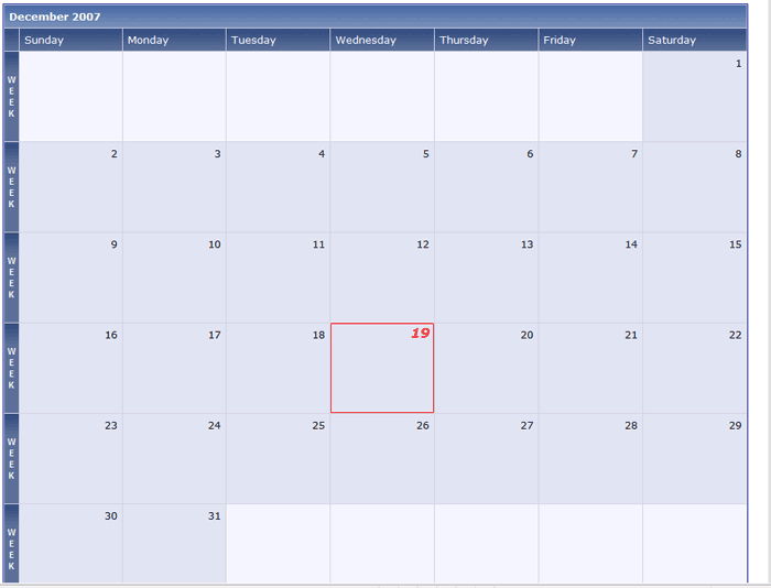
The monthly calendar in the default style is crowded and blocky with the day names on each row, unlabeled week view markers on the left and various other stylistic choices that make it fairly unusable. With this collection of modifications, I am aiming to make it more usable and present a better monthly view.
Some of the features include: Installation
Merge the style.xml file into each style you want to apply the changes to. This will only work on styles with unedited calendar templates. To do this follow these steps:
This would only need to be done if you have made modifications to the CSS here in the past.
Updates:
20080121 - Removed template edit that was conflicting with Farcaster's Event Signup Modification found at here:
Farcaster's Event Attendance
Support provided in this thread only to people who marked install.
The monthly calendar in the default style is crowded and blocky with the day names on each row, unlabeled week view markers on the left and various other stylistic choices that make it fairly unusable. With this collection of modifications, I am aiming to make it more usable and present a better monthly view.
Some of the features include:
- Single header row with the days of the week.
- Better date boxes which have a square instead of a rectangular layout. More like a standard calendar view.
- Easier to see highlighting of the current dates.
- Previous month and next month dates removed for better viewing.
- Link to the Weekly view on the left of each row distinctly says "WEEK".

Merge the style.xml file into each style you want to apply the changes to. This will only work on styles with unedited calendar templates. To do this follow these steps:
- Go to Styles & Templates -> Download / UploadStyles.
- In the Upload form, browse to the monthly_calendar.xml file
- For the Merge Into Style choose the style that these changes should be applied on.
- Tell the system to ignore the version number (just in case).
- Click Import.
- Repeat for each additional style.
Code:
#highlight { padding:0px; border:1px solid red; font-weight:bold }
#calendar_today {background-color:transparent;color:red;font-size: 130%;font-style:italic; font-weight:bold;}
.daybox {padding:0px}
#calendar_date {font-size: 115%;font-style:italic;}
Updates:
20080121 - Removed template edit that was conflicting with Farcaster's Event Signup Modification found at here:
Farcaster's Event Attendance
Support provided in this thread only to people who marked install.
Download
This modification is archived, downloads are still allowed.
![]() calendar_style.xml (4.8 KB, 360 downloads)
calendar_style.xml (4.8 KB, 360 downloads)
Screenshots
